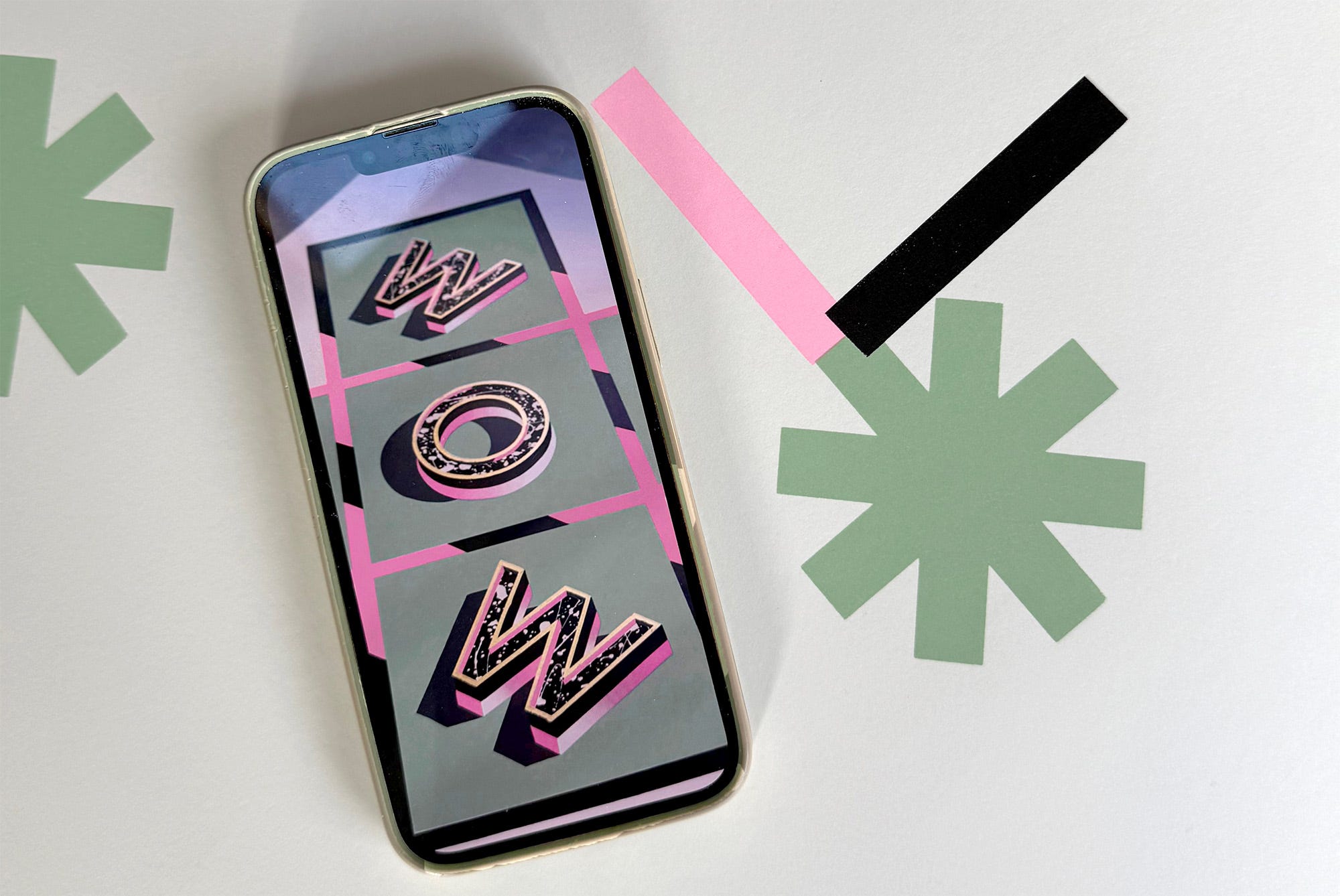
WOW - 4th Edition Presale Open Now
The early bird gets the cheap screen print

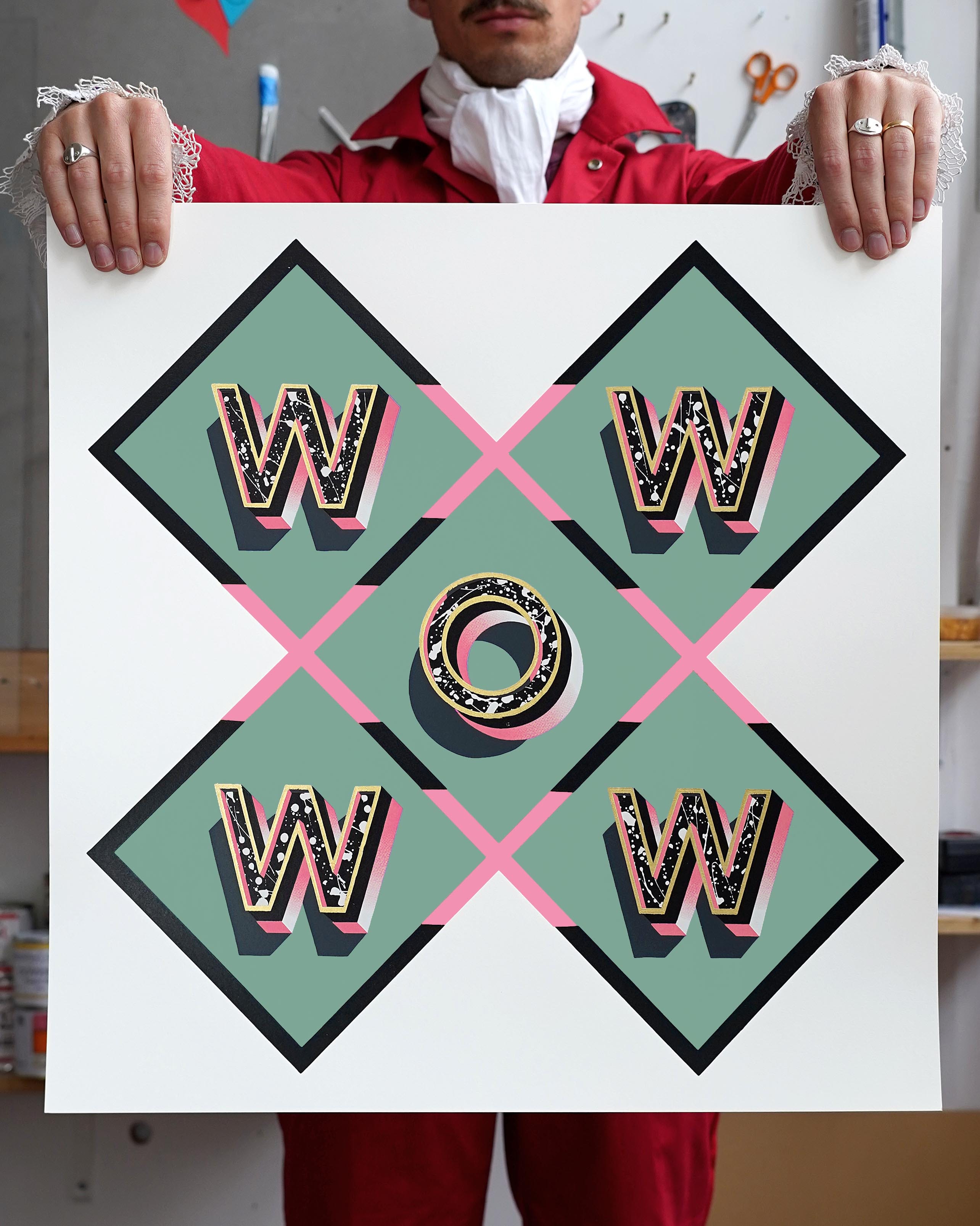
One of my all time favourite pieces ‘WOW’ is coming back for a brand new limited edition screen print. You can pre order one the new 4th edition now, and if you’re quick you can secure your one for less than half the final retail price.
I’ve structured this presale a little like early bird ticket pricing for a festival. This structure helps me cover the cost of getting these prints made by hand in London with love by the ever reliable Mansons Press. In return for waiting a few weeks for your print you get a bargain. You can pay £150 now for the same print that someone else will have to pay £350 for at the end of April. Think about smug that will make you feel.
I’m very excited about this new soft sage green and pink colourway. Its actually inspired by the colour I painted my living room when we renovated our house a couple of years ago: Pea Green by Little Green. Its very similar to the fancier sounding Breakfast Room Green by Farrow and Ball. I’ve loved having it on my walls. Its softer and bluer in the morning light and then warm and cosy under the lamp lights in the evening. Its a magically calming yet bright colour.
But what really surprised me about it, and made we want to use it in an edition, was how it made the artwork that I hung on those walls look incredible. It compliments stronger and more vibrant colours beautifully. Then I noticed that all of the artwork on that wall have a common colour: pink.
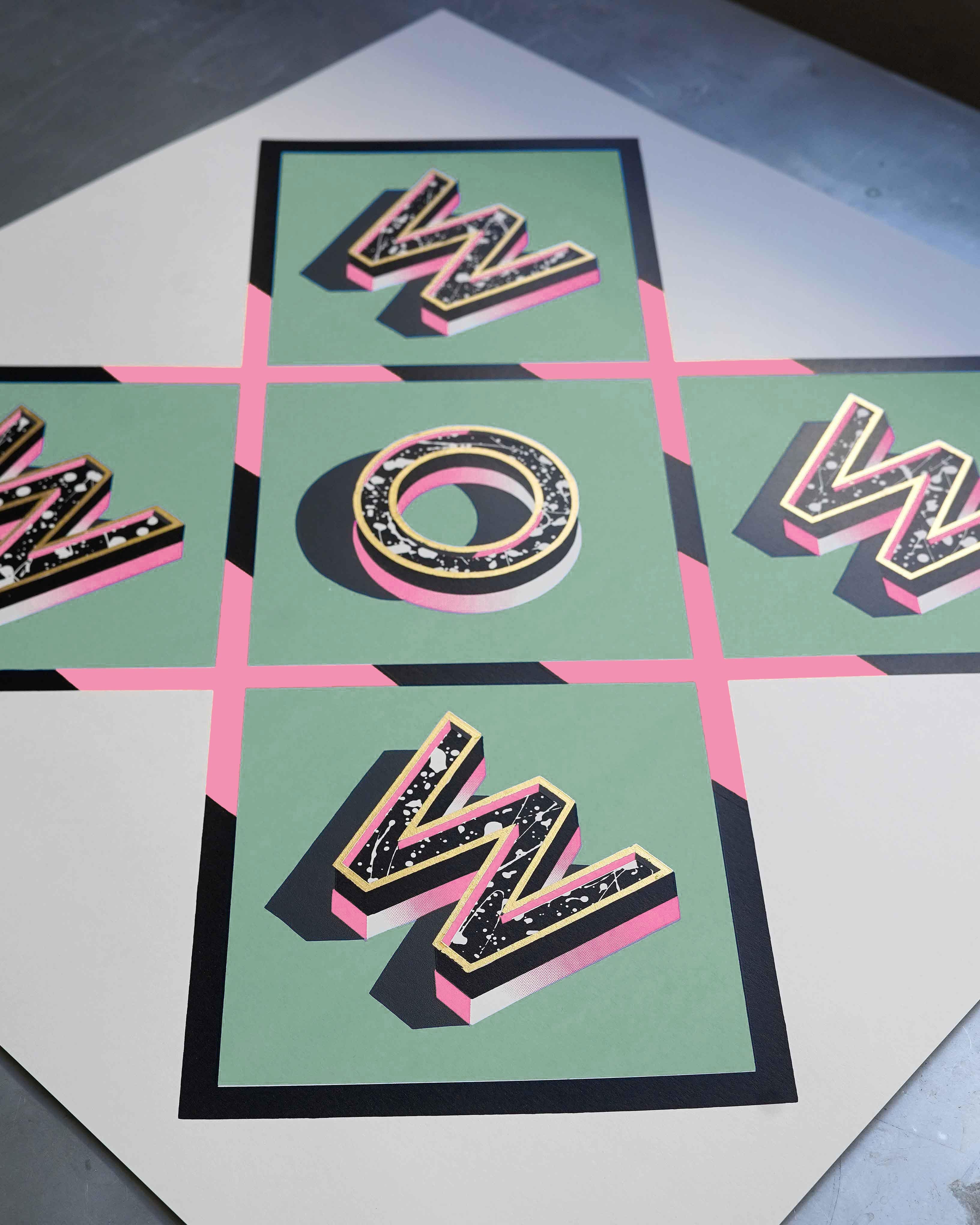
So that’s how I came to decide on the pink as the key contrast colour for this edition. And as you can see the 23.5 carat gold, pink and black really pop against the green in these mockups. There are just a handful of these early bird bargains available, so make you secure yours now before its too late.
Strictly Come Colour Mixing
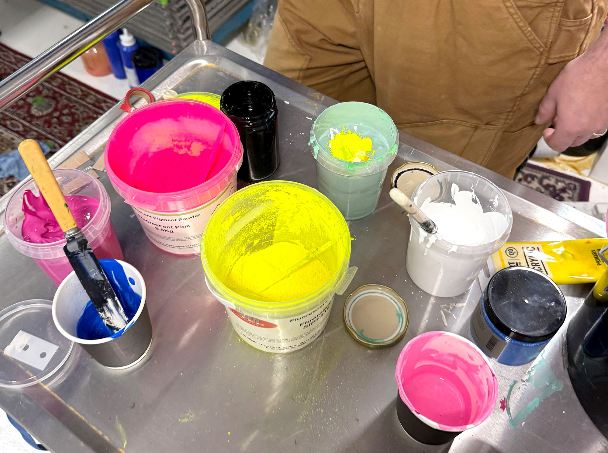
The photos above of this new print are just mockups, they’re what I create in photoshop to give as a reference to both you and Ali, my screen printer, to show how I want this new edition to look. If these were digital prints that would be it, job done, send to print. But these are screen prints, which means we need to get our hands inky and actually create these colours from scratch using pigments, pearlescent powders and paints mixed up together in pots until they’re right.
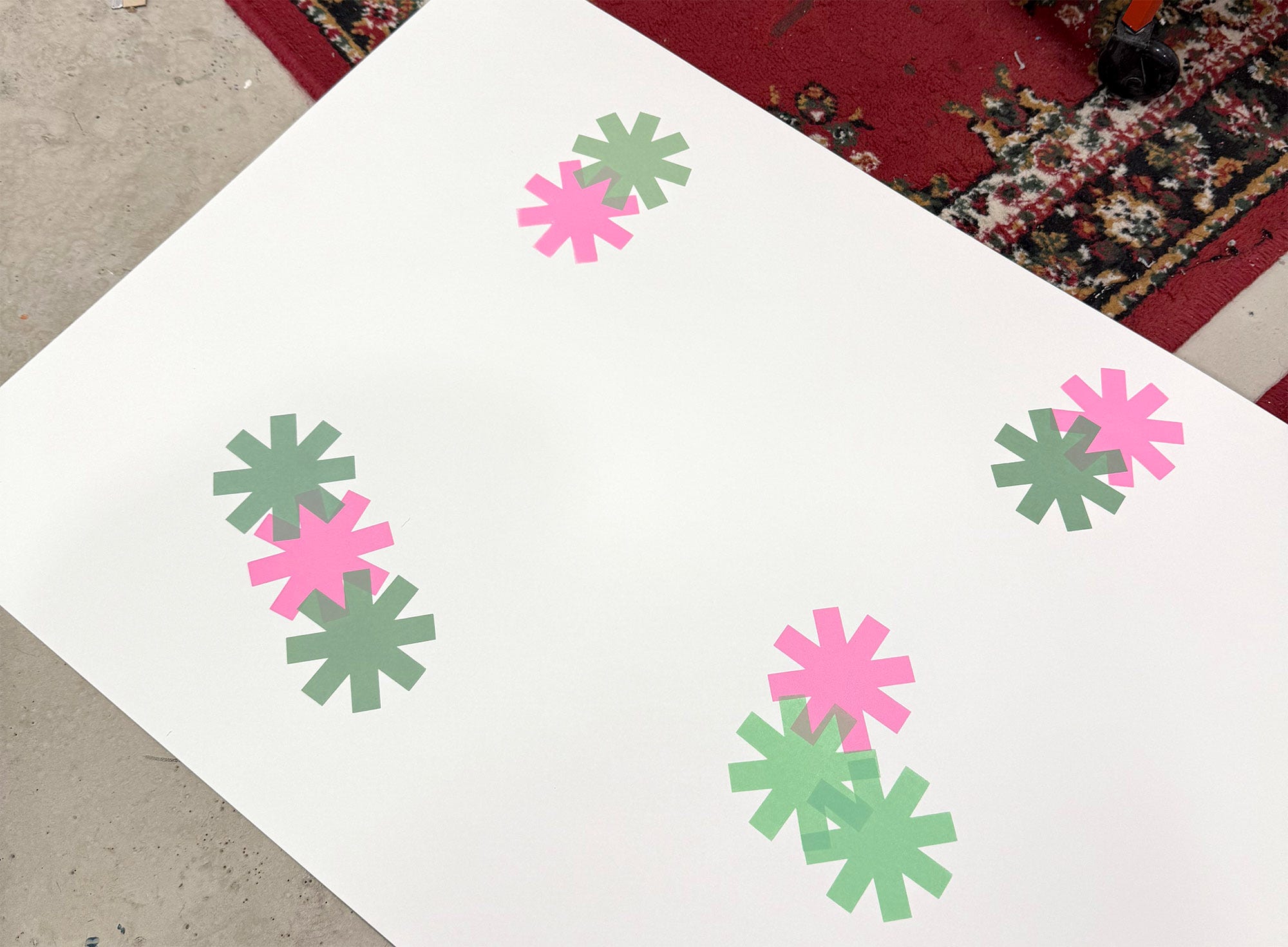
Once we have a rough mix of the two key colours a dance begins. Pairs of little stars are printed onto the paper we’ll use for the edition and judged for their accuracy and impact. Then the tweaking can begin: adding more blue to deepen them, or white to lighten or perhaps more binder to drop the opacity until our final pair emerge victorious as the winners of the paint mix dance context.
The winners are very close to what is in the mockup but never the same. They never can be the same because they exist in reality on paper, not on the various screens that you’re looking at them now, all of which are calibrated to show colours slightly differently.
That’s what I love about creating screen prints of my work. The final result is something closer to a painting because its created in a similar way. To make these prints the colours are mixed by eye by an artist to elicit the emotions they want to express. The only way I can communicate these things to you is via a screen, but when that postal tube arrives at your door and you slide your new ‘WOW’ print out and carefully unwrap it what you see in reality with your eyes will have more life and elegance than I can ever express in writing or with images. You just have to trust me.