

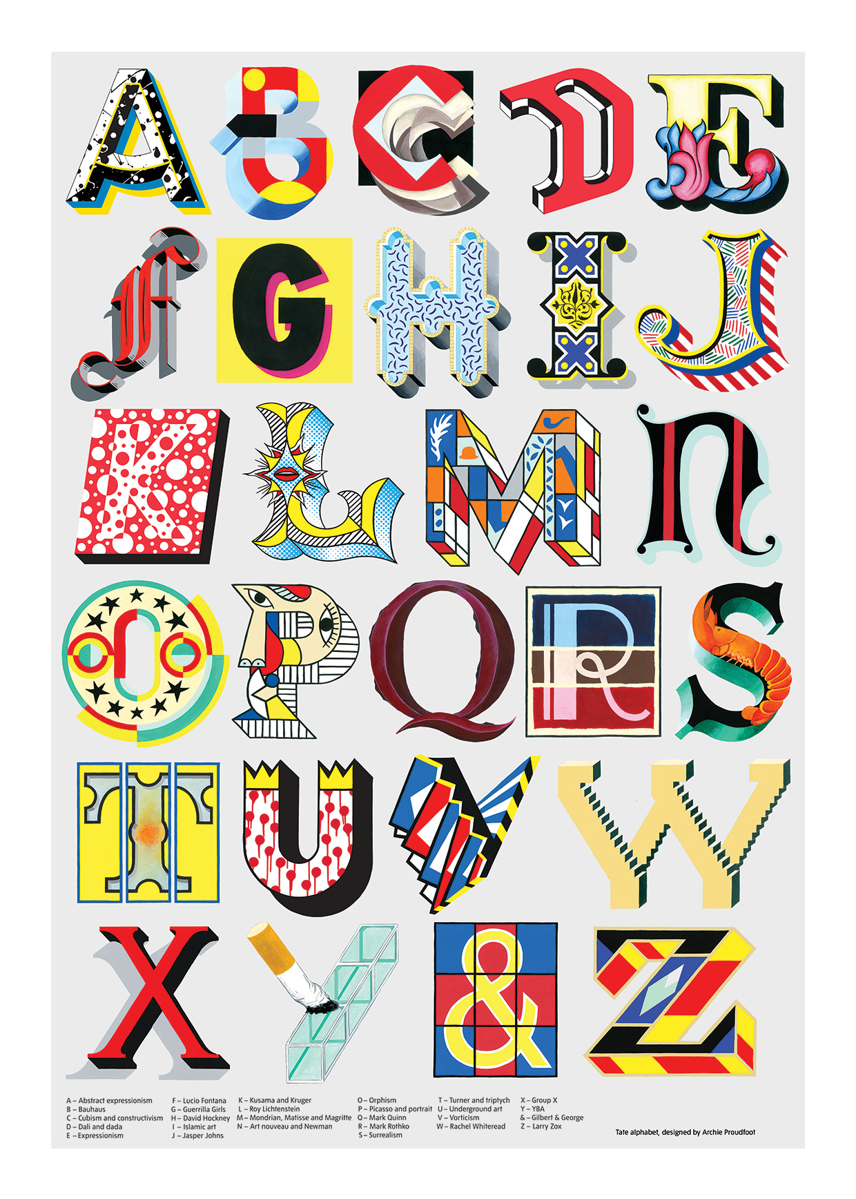
The Alphabet of Art is back!
The Alphabet of Art is back!
Mini giclée prints available for a limited time only

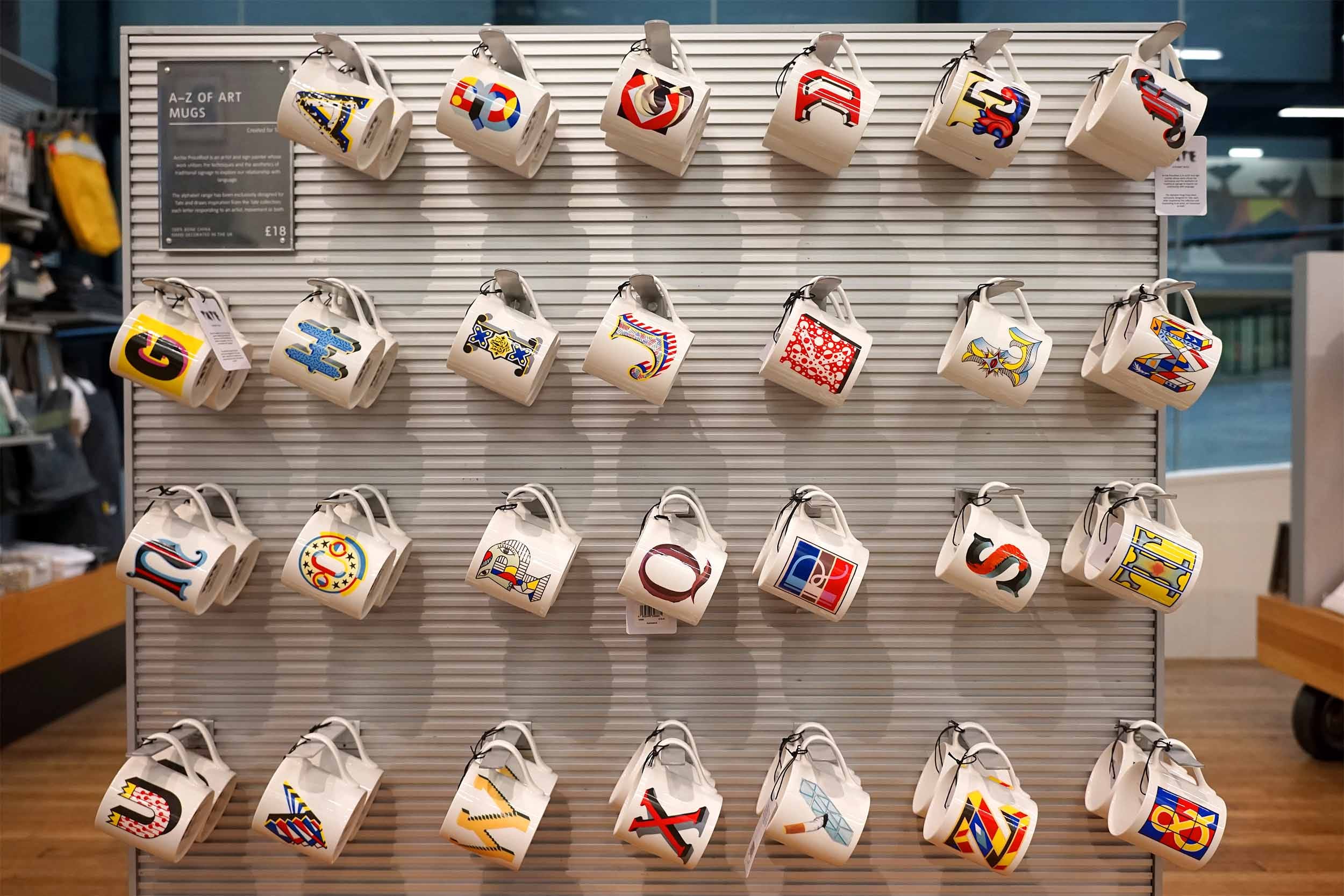
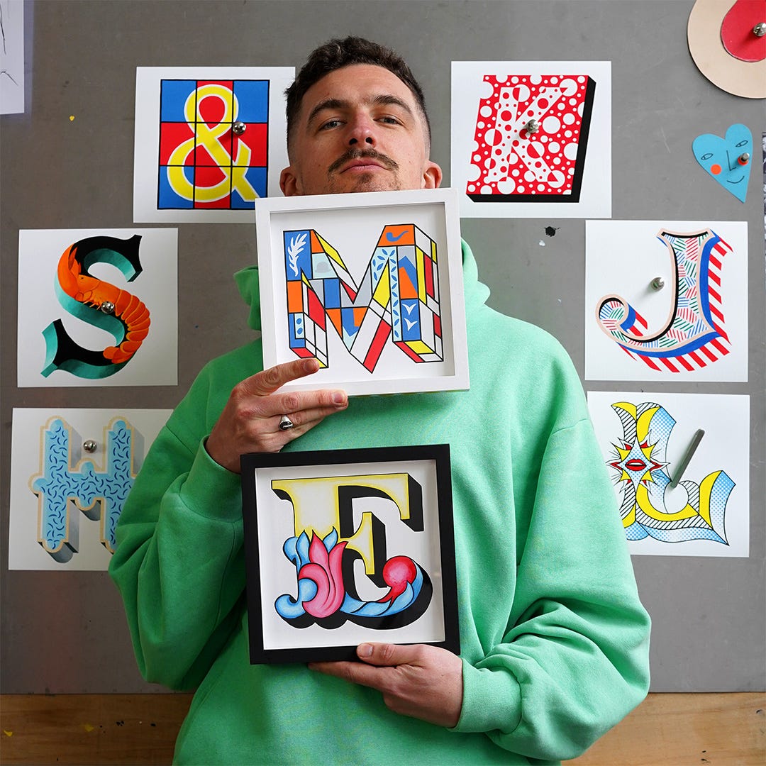
The Alphabet of Art is back! Originally released in late 2019 as a series of initial mugs and a poster in the gallery shops of the Tate Modern and Tate Britain, I’ve decided to resurrect this series just in time for Easter as small but perfectly formed giclée print editions.
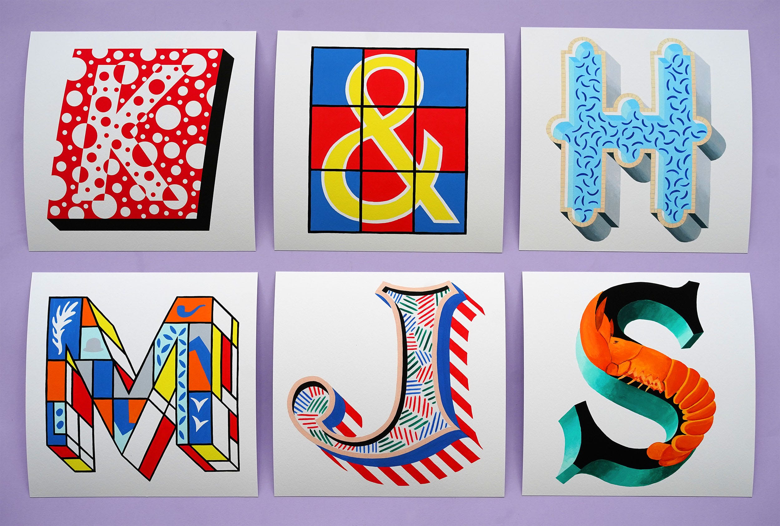
The full A-Z of modern art history, including the ampersand for Gilbert & George, is available for just ten days. At midnight on the 7th of April they’ll disappear again from my online store. Priced at just £35 each this is most affordable series of editions I’ve ever released, so pick up a P for Picasso or an S for Surrealism while you can.
You can get 10% off anything in my shop this Easter weekend, including this new series with the code: RESURRECTION


Below is the story of how this series came into being. I needed to exorcise a few demons from that time, so its quite long. If you’ve got one of those alphabet mugs, make yourself a cuppa and settle in.
Its the Tate!
This project has mixed emotions for me. It was the most high profile and complex commission I’ve ever been asked to do, there’s a lot of pride in what I managed to pull of with it. But it was also emotionally and physically draining, and ultimately financially disappointing.
When the Tate commerce team first got in touch with the idea of collaborating on an alphabet for their shops I was obviously very excited. Its the Tate! In the land of dream commissions this wasn’t even really on my radar as a possibility. The first meeting went well, I was given a fairly open brief: we want a new alphabet to put on a range of mugs, do what you like, we love your work (the kiss of death), but if you’re interested in trying it could be nice to make the design of each letter relate to an artist or a style or a movement.
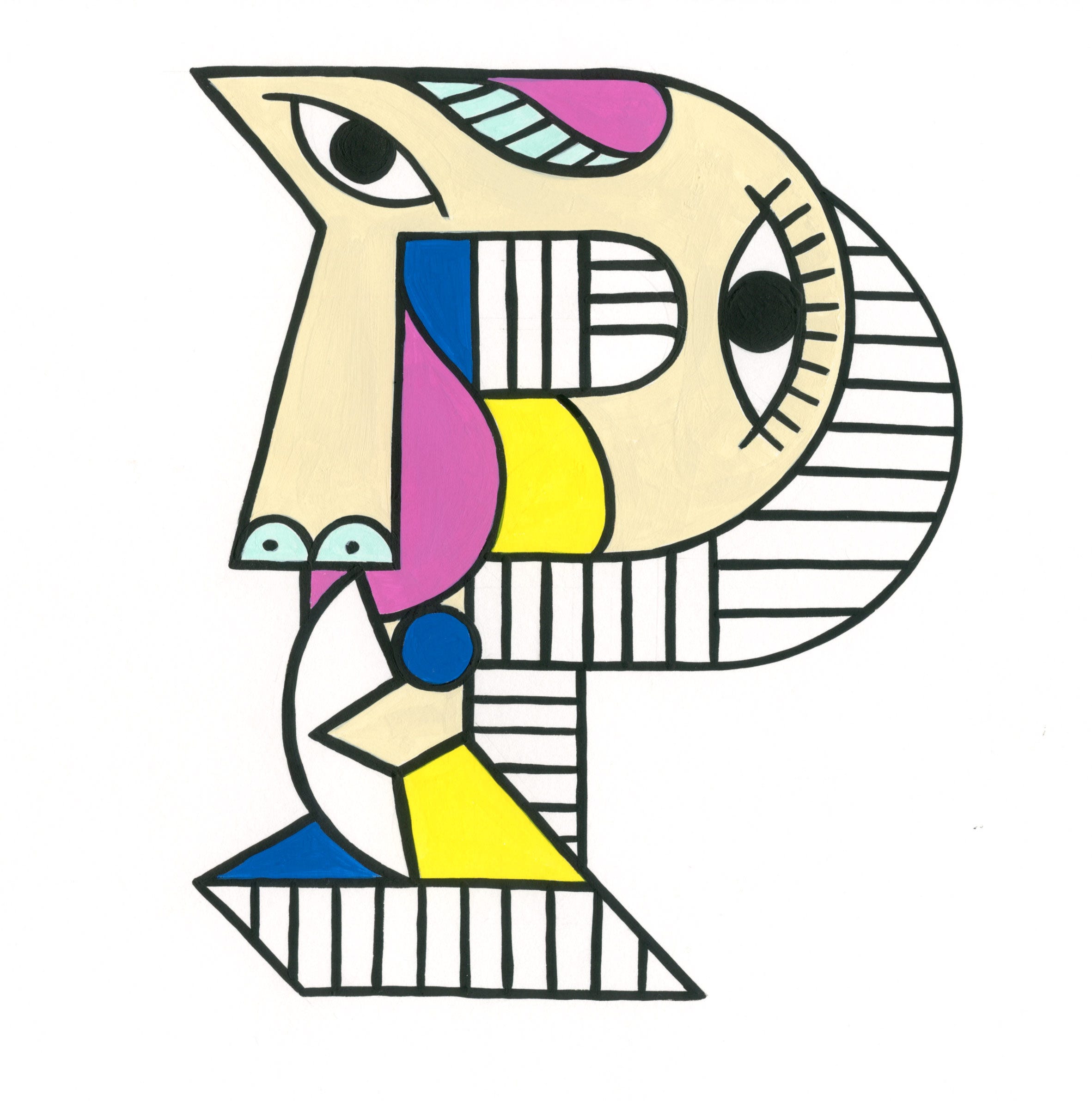
I didn’t really think that the Alphabet of Art was possible. I sucked my teeth in true tradesman’s style and went away without making any promises. But sometimes when you sit down and start sketching out ideas for a new project a vision arrives very clearly in your mind’s eye (its Easter allow me this). That vision was the P for Picasso. I sketched it out and suddenly the Alphabet of Art felt like a possibility, maybe I could do it! It was the wonky face that launched a thousand ships and embroiled me in months of creative conflict with myself, the Tate commerce team and their legal advisor Bernard.
In the battles that followed there were many moments when I wished I had just designed some cool looking type. You know, what I was already pretty good at, something recognisably my style. Easy peasy. But no, I had to let the chameleon out of the cage.
MR J CAMELS
On reflection I was the right chameleon for the job; uniquely placed as someone both riding the wave of the sign painting craft revival and the child of a very artsy middle class home, who had been dragged around London’s many galleries for most of their childhood’s weekends. In the living room of my family home there’s a whole five shelves dedicated just to art books picked up on these gallery trips. As a teenager the section of Japanese erotic art was particularly embarrassing. When my parents went away for the weekend and I inevitably had a house party these books got pulled out and poured over and laughed at.
But now all of these influences from the awkward gawky years could filter through into the biggest project of my career to date, I was armed with a wealth of subconscious knowledge to bring to bear. Not the erotica sadly, that would have been too spicy for this job.
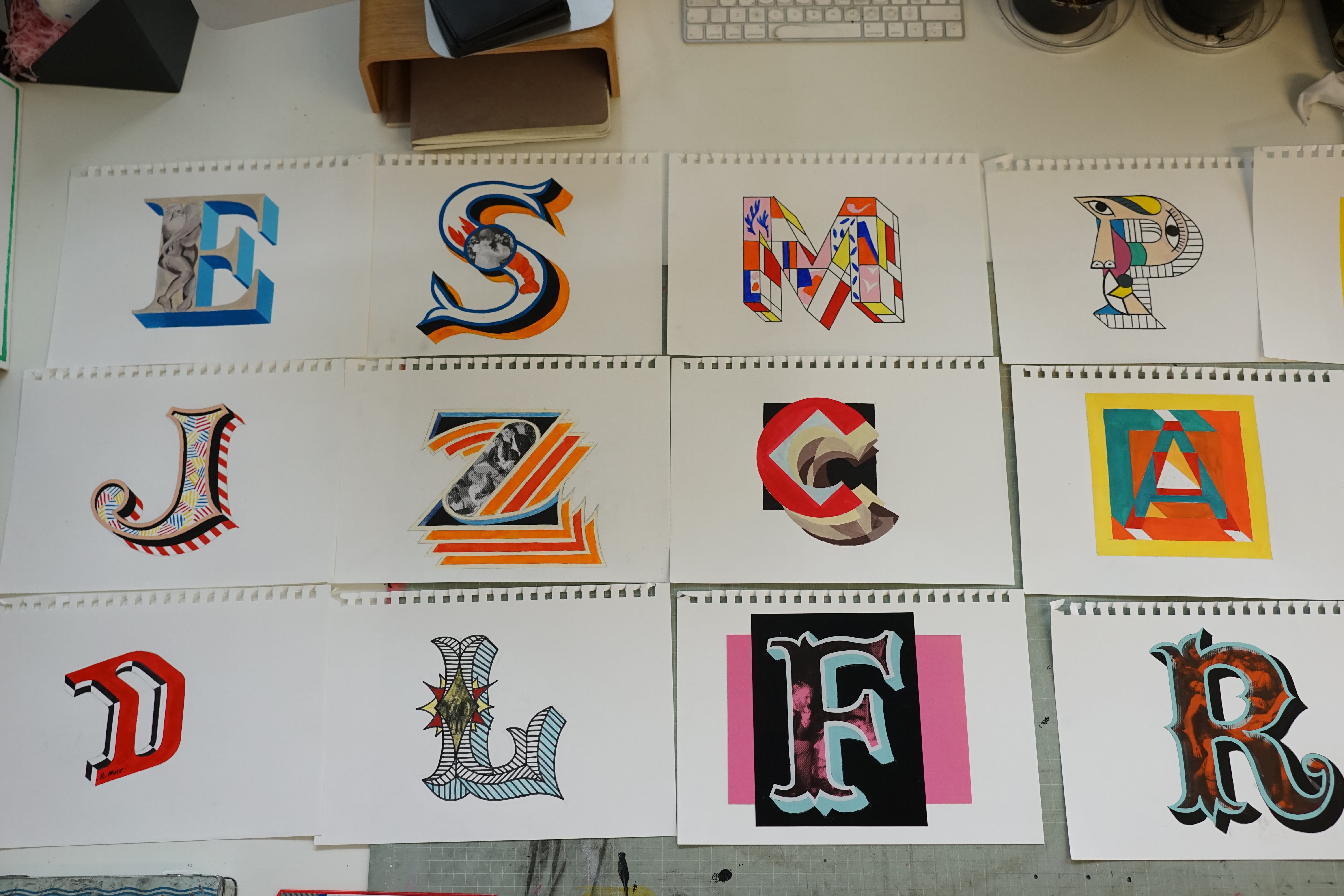
Still, a full 26 character alphabet would be a big task. The commerce team helped me out by offering some insider knowledge about initial products, the majority of the sales come from only a handful of letters which spell out MR J CAMELS. So that was where I should focus my energy first. I went away and got down to work on the first set of roughs. At this point I was having a lot of fun. Any project that requires a good amount of research and for me to render those findings as little visual clues really lights me up. And I was starting to see how the alphabet as a whole would work a kind of visual puzzle that could be deciphered by art lovers and total amateurs alike.
With a first set of roughs I set the follow up meeting to get some feedback. This was the first and last time I got any feedback in person on the project. It went well though, they were generally really into them, but weren’t keen on me using images of some older paintings embedded in the letter fills. I liked the depth this gave to the ‘puzzle’ but they wanted me more graphic and more contemporary. The Tate Modern is unsurprisingly the big commercial engine of their enterprise. I saw the figures when I went in to brief the sales team after the mugs launched, the Tate Modern takes over £20k on a quiet Monday in January, imagine what a weekend in prime tourist season looks like…
Cow Print KT Tape
In retrospect one of the things that made this project so damaging for me was a naive approach to the process on my part. I was designing and then painting all of the roughs, revisions and final artwork onto sheet after sheet of A4 paper so that they could be easily digitised by my scanner. That meant packing a lot of complexity and detail into a very small space. Now I know that I could have just painted them much larger and photographed them for the same result. At the time I thought A4 was the only way.
Earlier that year, while applying the final coat of protective varnish on five days of intense glass gilding work in the Highlands, I had started to feel a strange kind of discomfort in my forearm and elbow. Over the next few months this strange sensation slowly snowballed into a pain that I still manage to this day. It was the beginning of my relationship with RSI, repetitive strain injury or tennis elbow.
Painting small and fiddly really flares it up, its the fingers pinching on the brush and only making small movements that does it. And that was exactly what I was doing every day for months on end working and re-working ideas for this alphabet.
I also learnt later that stress is major factor in the inflammation of RSI. The unconscious tension of your mind wandering in worries grips the body and its movements, everything tightens and more pressure is put on those tendons. That job in the Highlands had been stressful. It was already a big ask to complete a huge amount of gilding work on my own in just a few days but what really fuelled the fire was the client hovering over me, critiquing my work as if I was on Illustrator and asking me to do things in an order that suited the fact she’d stupidly hired a photographer to capture the finished signage at the same time as it was being done.
The Tate now started to turn the screw on me as well. They had asked me to try and include as many female artists, as well Black and Asian artists so they didn’t get accused of a lack of diversity. Fine, but it turns out that the history of art is both racist and sexist. Who knew? This project was also an intellectual property minefield. Every letter needed to be approved by Bernard, their legal advisor. They were very worried about pissing off living artists that they had some existing relationship with, dead artists were fine. Problem was that institutions like the Tate didn’t really give Black or female artists the time of day until after 1980, so most of them are still alive.
And then there was the coded language. I wanted R to be Bridget Riley, who is a big influence on me, but they said she could be “quite difficult”, so the R was Rothko instead. I wanted Chris Ofili in the O, so referenced his painting No Woman No Cry with some tears in the design. They asked me to remove them because that painting was “racially sensitive”. So it became the obscure Cubist offshoot Orphism. A few months later, in the wake of George Floyd’s murder, that exact painting was the one the Tate chose to post on their instagram in response to the tragedy. There were more farcical moments as well, like when they told me “Gary in Finance thinks the cigarette on the Y for YBA could be considered offensive to non smokers”. Heaven forbid the YBA’s cause any offence!
In the midst of this increasingly fractured feedback I got bogged down and my elbow pain became acute. Weekly physio sessions which took place in a tiny windowless room in a muscle gym in Wood Green were required to keep me functioning. A lovely but ridiculously stacked body-builder physio massaged my forearm before sticking twenty or so acupuncture needles into to provide relief. He then gave me a choice between colours of Kinesiology tape to finish the job, I chose cow print. I made the video below to document my physio exercises at the time.
M for Michael
Finally, after many months frustrating emails and physio sessions, the full alphabet was completed and ready for a launch just in time for Christmas. I got paid a modest up front design fee for this work, £2k, not bad but not months of work money. The real reward was supposed to come in the fee per mug sold in the shops. Those hundreds of thousands of Londoners and tourists alike who flood the Tate galleries every year cruising the gift shops, looking for a little present were the ones that would make all the pain worth it.
I would get just over £1 per mug. Not much when you consider they were retailing at £18 (which was too much for a mug), but when think of the numbers involved, all those visitors, it could easily add up quickly to a very tasty trickle of pillow money. And as long as they were selling they would keep producing them. Some of their other artist collaborations have been in their shops for years and years steadily juicing the original creator’s bank accounts with every sale.
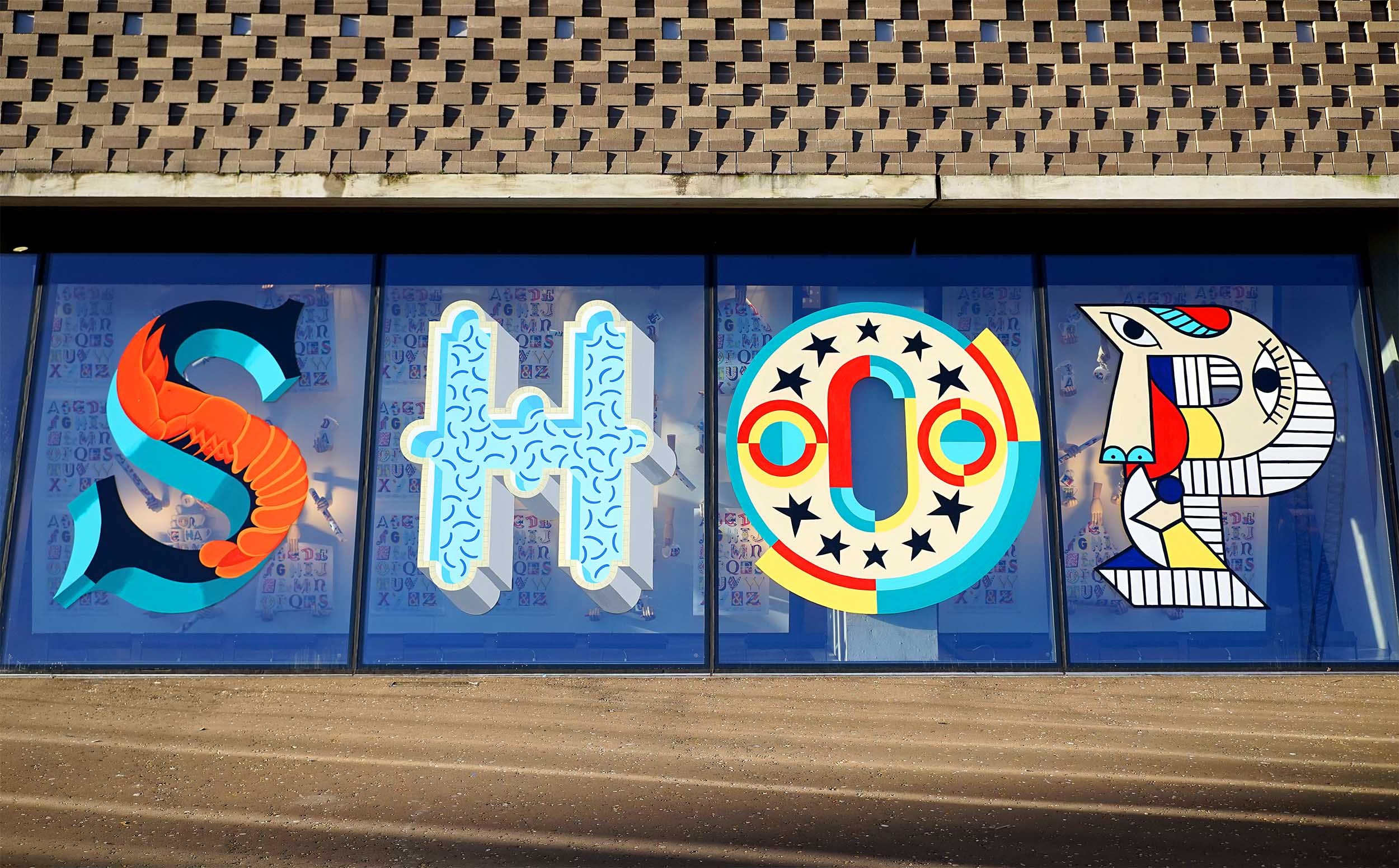
In early January, after a rushed launch in mid-December, they asked me to come and paint a mural of the letters on the windows of the Blavatnik extension of the Tate Modern to really announce the new collection in the gift shops. On the 3rd of January my Dad died, nine months on from being given a terminal cancer diagnosis and roughly a year to live. The last Christmas present I gave him was the M mug. M for Michael, he loved it, he was proud. A week later I was out in stormy conditions realising these tiny A4 designs as two metre tall letters on the tricky sloping glass of the Blavatnik. Obviously that wasn’t a good thing for someone in the early stages of losing a parent to be doing, but he would have 100% wanted me to do it. Think of the artsy middle class bragging rights on that! And it was only due to be up for two months, so I couldn’t have delayed it much longer.
For the first two days I was fine, it was nice to totally zone in on a task, out in the wind and swirling rain I felt alive. But on the morning of day three, heading in on the tube to do the last of the second coating, I had a very strange physical collapse. Out of the blue my legs went from under me and I had to get off a few stops early because I felt like I was going to throw up. The body keeps the score. I stopped off at Pret to get an almond croissant to level off and got down to finishing off, knowing that I was close enough to the finish line to crawl over it by lunchtime.
That morning the storm finally broke and the low January sun emerged through the clouds. For the first time there were more visitors milling around me as I finished off the mural. ‘Live painting’ inevitably attracts a crowd, but I wasn’t really in the mood for comments. At one point I heard the voice of a middle aged man behind me, a Dad, showing off in front of his wife and two teenage kids attempting to take the piss. I turned around, he was smirking, his son was giggling, his wife and daughter looked mortified. Sign painters I very used to this kind of shit, don’t test us with your windups, we’ve heard it all before.
I decided to turn teacher and put him on the spot for a little art history test. I explained that each letter in the SHOP mural related to an artist or movement, so what was the P for? He suddenly looked very scared, “erm, Picasso?” Yes! well done, now what about the S? “erm…. is that Dali?”, yes but what was Dali? He was a… He looked at me blankly, “Surrealist!” his wife chirped in. Sensing she was the brains in the operation I moved on to the H, she looked and thought for a moment and then in a very uncertain voice offered “Hockney?” Brilliant! I moved on the O, knowing that they would never get Orphism. But that’s the key to any good puzzle, there’s an easy one to pull you in, then slightly trickier ones to make you feel clever and then a couple that leave anyone but the most knowledgable dumbfounded.
To me this was a beautiful moment. The whole concept of the Alphabet of Art in action with people coming across it for the first time. It worked! It was alive and out in the world. My work was up in the Tate bloody Modern, not bad. Fifteen minutes later the Dad came back with his tale between his legs and a peace offering for being a bit rude: a pack of Rowntrees Fruit pastels. Those chewie little sweets tasted like victory. The war that had started all those months ago with a wonky Picasso face was finally over.
In and out of Lockdown, I ain’t got a series of mugs in the Tate now
No one could have predicated what would happen next. Two months after i finished the mural, and several weeks later than it should have been, the country went into lockdown to stop the spread of the novel Coronavirus. The Tate galleries shut their doors for months, it would be two years before they were really back to ‘normal’. Their retail operation wasn’t set up for the shift to online shopping. The product photography they had of the mugs was truly awful, they looked like photos taken on someone’s phone and then hastily photoshopped to remove the background. No one was going to spend £18 on a something like that from the comfort of their sofa prison. So the mugs just fizzled out. By the time they finally fully reopened their doors they Tate commerce team had new collaborations to launch, the Alphabet of Art was no more.
But luckily for me there was a clause in the original contract that gives me the printing rights back to this series once the Tate had stopped producing it for over a year. For a long time I didn’t really have any desire to go back to this project. I was moving forward in my career, away from stress inducing commissions like this one to selling my own print editions direct to you lovely people. While the Tate’s doors were shut I was shifting high quality limited edition screen prints, hand finished with gold leaf by the bucketload. It was the easiest, most enjoyable and the most lucrative period in my ten year career. I was serving the sofa imprisoned exactly what they needed.
Just as I was settling in to this beautiful new reality the ground shifted again. An actual war in Ukraine, the impact of the pandemic and Liz Truss sent the price of everything spiralling ever upwards into the cost of living crisis. Suddenly the no longer imprisoned didn’t have a few hundred quid spare to get something nice for their walls. What money they did have was being spent doing the things that had been denied to them for the last two years: going for a pint, a meal in a fancy restaurant or to Italy for a few days in the sun away from Hell Island.
As someone who doesn’t have a few hundred quid to spend on art themselves because of this rolling crisis I’ve never liked that I don’t have what could unflatteringly be termed a ‘budget’ option on offer in my shop. High quality, hand made screen prints that are hand finished with gold leaf aren’t cheap to produce, nor should they be cheap to buy. And it takes the same amount of time and admin for me to pack and post a £35 print as it does for a £395 one. Sticking to the high end is a no brainer from the perspective of my labour.
But recently the brilliant Diane Hill was discussing how she managed to scale her art sales by using drop shipping services. One of the companies she uses is one that I’ve also used for my digital printing for ten years now: Printspace. They produce archival quality giclée and C-type prints. And they’re based just up the road from me in Shoreditch. Seeing Diane use their dropshipping service so effectively was a lightbulb moment for me. They print your Alphabet of Art initial, pack it up safely in an envelope, create the postage label and slap a sticker with my logo on there for good measure. Which means you can get a gallery quality print from me at an affordable price and I don’t spend days drowning in order management, free to spend more time creating new work for you to enjoy in the future.
Its perfect really. But to keep things interesting and fresh I’ll only be offering collections of work like this one at a certain size and price for a limited time only. These dinky 20cm x 20cm Alphabet of Art initials for £35 each will be live for just ten days.
What’s more the original A4 paintings that I suffered so badly to create lost a lot of their detail in the manufacturing process to turn them into mugs. These prints on the other hand are virtually identical to those paintings. What you’re getting now is the real thing, direct from my tendonitis ridden elbow all those years ago. So please, treat yourself or a loved one to one of these beautiful little prints and help make the fact I still have to wear a wrist brace most days worth it. No pain, no gain.
I was so excited to shop for Z I didn't read the newsletter and missed the coupon 🙃😅 BUT ANYWAY so excited to get something from your shop that really goes great with my themed gallery wall.